Retailer to fight planners over 'garish' shop sign
TOWN retailer Blacks is set to launch a fight for its signage and appeal against planners ruling it 'garish' and out of keeping with St Peter Port.
The case has attracted significant public criticism, but Environment planning director Jim Rowles said the department was sticking to its guns.
He also revealed it planned to review other signs around Town, although he stressed this was not about 'being nasty to business'.
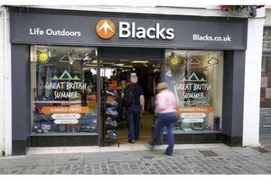
Earlier this year, to replace the Millets branding, outdoor goods retailer Blacks installed on the shop's Pollet side a main fascia sign above the window and an orange mountain logo which sticks out into the street. It also has a large black sign on its North Esplanade side.
It was the combined impact of these three signs which led to it falling foul of planners and having a retrospective application for them rejected.

Mr Rowles said his department stood by its statement that the orange perspex mountain sign was garish. That description referred to the material as well as the colour, he added.
'If you look at other signs nearby, like Pasty Presto, there is a more traditional approach,' he said.
'This is a protected building in a conservation area.'
He added that the department was open to all colour schemes, but in this case the orange colour highlighted what was an already unattractive sign.